Overview
Project: Redesigning the SAP Time Entry Mobile Application
Role: Led user research and design
Duration: 18 months
Impact and Results
•

3x faster time entry process for weekly time sheets
•

65% less fields shown on each page in the app improving clarity
•
45% reduction in total pages in time entry process
•
88% positive response rate in usability testing with workers
Problem
The existing Time Entry mobile application received negative reviews throughout the mobile application stores. The average rating was 1.95 stars across the Google Play and App Store. The challenge was to redesign the application to provide a seamless time entry experience for workers.

"It looks like the application was designed for a database not for people. Poor design and difficult to use." -iOS review

Old Time Entry App - Add Task

Old Time Entry App - Add Time
Research and Insights
• Analysis of Google Play and App Store reviews using AI
• Data mining to better understand user behaviors
• User interviews with 8 workers to understand behaviors
Key Insights:
• Tedious time entry process
• Information overload and lack of hierarchy
• Outdated user interface and design patterns
"Wow tap tap tap tap type tap tap tap tap type. The UX on this app is a joke. Way too many screens to go through while entering timesheet values." -iOS review


Information overload

Outdated design patterns

Tedious process
Design Process
Sketched and wire framed initial ideas to gather feedback on designs and iterate quickly:
Proposed improvements:
• Copy time functionality for more efficient entry process
• Modern mobile design patterns & components (calendar, card, time picker components)
• Progressive disclosure to show only the most necessary information

Home page and enter time
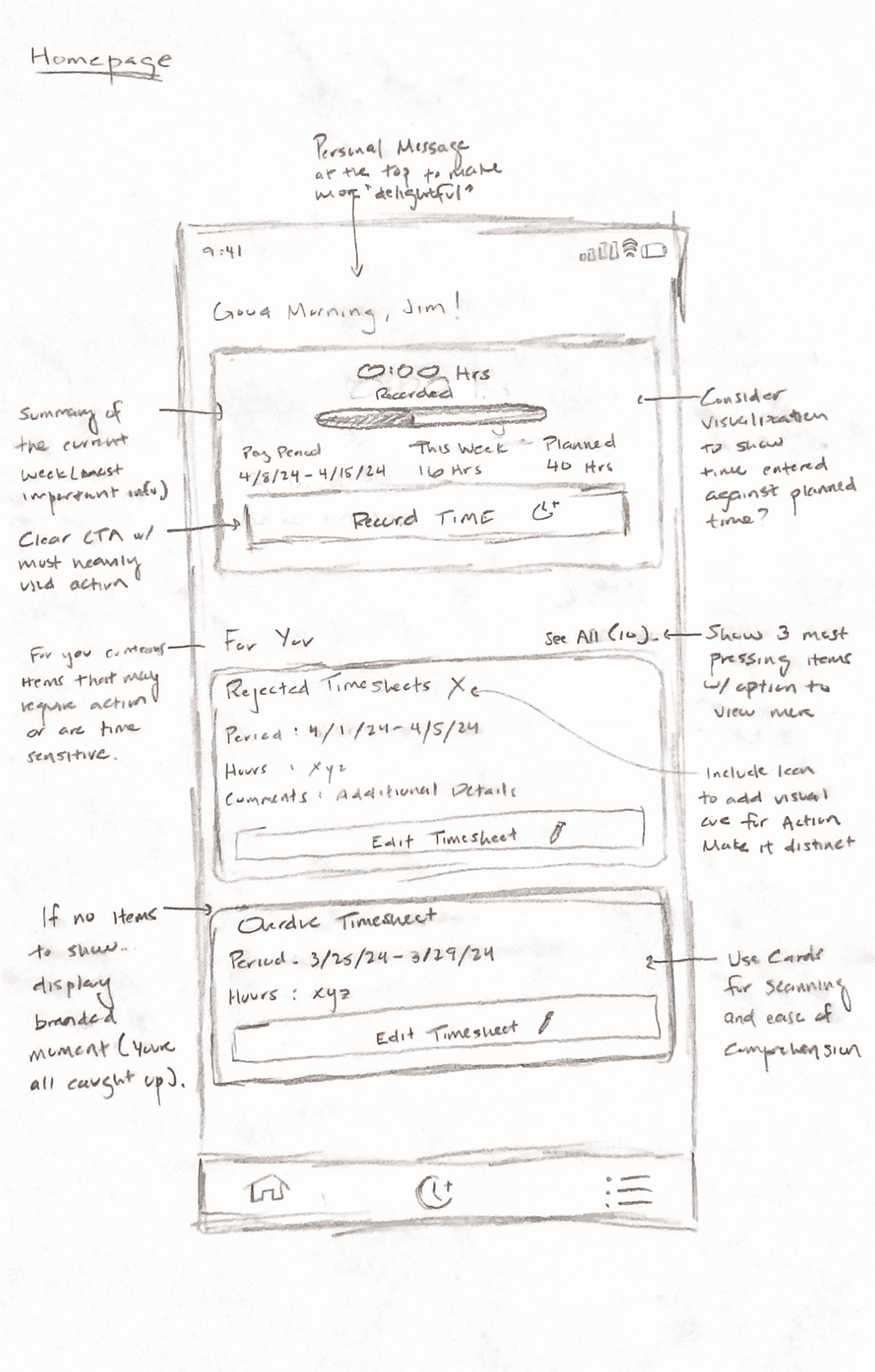
Home page

Enter Task and Time

Monthly time sheet calendar

Copy Time (Monthly Time sheets) idea 1

Copy Time (Monthly Time sheets) idea 2
Prototyping and User Testing
• Created interactive prototypes in Figma
• Conducted usability testing with 5 workers to test and validate design decisions
Takeaways:
• Users liked copy time and modern design
• Confusion surrounding whether entire time sheet would be submitted or just one day
Final Solution
• Onboarding process to reduce confusion in registration process
• Improved progressive disclosure to reduce information overload and highlight main actions
• Copy time functionality to speed up time entry
• Review and submit time sheet pages to confirm time entries
.png)
Onboarding flow

Add task and time flow
.png)
Copy time flow
.png)
Submit time sheet flow
Key Learnings
• Constraints lead to creativity - Constraints in the tech we used to develop the app limited the amount of components and patterns we had access to for the designs. This required get creative in using what we did have to solve pain points and meet the established goals.
• Gaining alignment among stakeholders - There were several stakeholders I met with on a weekly and monthly basis to present design progress. At first, it was extremely difficult to align everyone on a path forward. Over time, I learned how to effectively align stakeholders on designs early to ensure we continued to move the project forward.
More Projects

Delivering components for the SAP Design System
Building design system components for the SAP Fiori Mobile Android Design System
Read More >
Co-founder and Head of Design for Dendritic Health AI
Co-founder and head of design for a medical education platform that helps students study for their board and institutional exams
Read More >
