Overview
Project: Designed and delivered new components for SAP design system
Role: Led user research and design
Duration: 6 months
Problem
In the existing SAP android mobile design system there was no component that offered the ability to organize information across multiple pages. This led to designers for different products creating their own unique controls. This worked against SAP's business goal of establishing a consistent look and feel across the product portfolio.
"There are (will be) use cases, when we need to help people selecting options, switch views, or sort elements within a specific page." - SAP Ariba UX designer

Different Components created by SAP products
Research and Insights
Research
• Conducted user interviews with 8 stakeholders across 6 different SAP products
• Researched and evaluated components in the Google material design system
• Met with iOS team to understand existing components and patterns for parity
• External research with other mobile applications to understand common components
Key Insights:
• Can have large number of section so tabs must be scrollable
• Important for users to be able to scan categories quickly
• Need for category disbaled state among several stakeholders
• Need to pin tabs for pages with lots of content

Gathering use cases from product areas

Synthesis of requirements
Design Process
Sketched and prototyped initial ideas to gather initial ideas.
Proposed component variations
• Primary navigation
• Secondary navigation
• Horizontal Scroll
• Vertical Scroll with fixed navigation
• Label only, icon only, and label + icon variants
Stakeholder Feedback
Shared prototypes and intial ideas with mobile desing team and stakeholders to gather feedback.
Takeaways:
• Component and variants met their 90% of gathered stakeholder requirements
• Not enough ROI to include secondary navigation variant of tabs
• Need to be considered and design for certain edge cases
"This makes it easier to find things quickly. We used to have 8-10 sections stacked on top of each other on one screen" - Stakeholder

Early tab component designs

Edge case from Android design lead
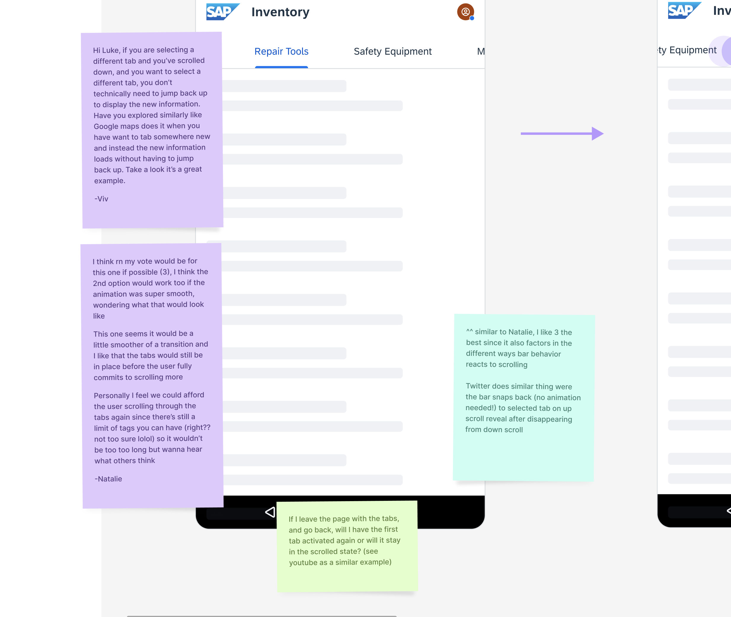
Feedback on edge case solutions
Final Deliverable
Tab component with variations
• Horizontal scroll
• Vertical scroll
• Label, Icon Only, and Label + Icon variants

Tab component variants

Spacing specifications

Guideline document for design system

Working component in Figma

Keyboard navigation
Impact and Results
• Component successfully launched into Fiori mobile design system
• Adoption across LOB's
• Improved standardization among SAP product suite
Key Learnings
• Attention to detail - Having most of my experience designing for products I took design systems for granted. There is a lot of work and attention to detail in crafting components. These components serves as the foundation for great applications
• Structured feedback - Structuring feedback files can help improve requirement gathering and feedback sessions by making the focus more clear
• Enablement - It is not enough to build the component. Delivering clear guidelines that provide detailed and specific instructions is key.
More Projects
.png)
Speeding up Time Entry Process for SAP workers
Redesigning a mobile application with 100K+ downloads on the app store to improve the time entry process
Read More >
Co-founder and Head of Design for Dendritic Health AI
Co-founder and head of design for a medical education platform that helps students study for their board and institutional exams
Read More >
